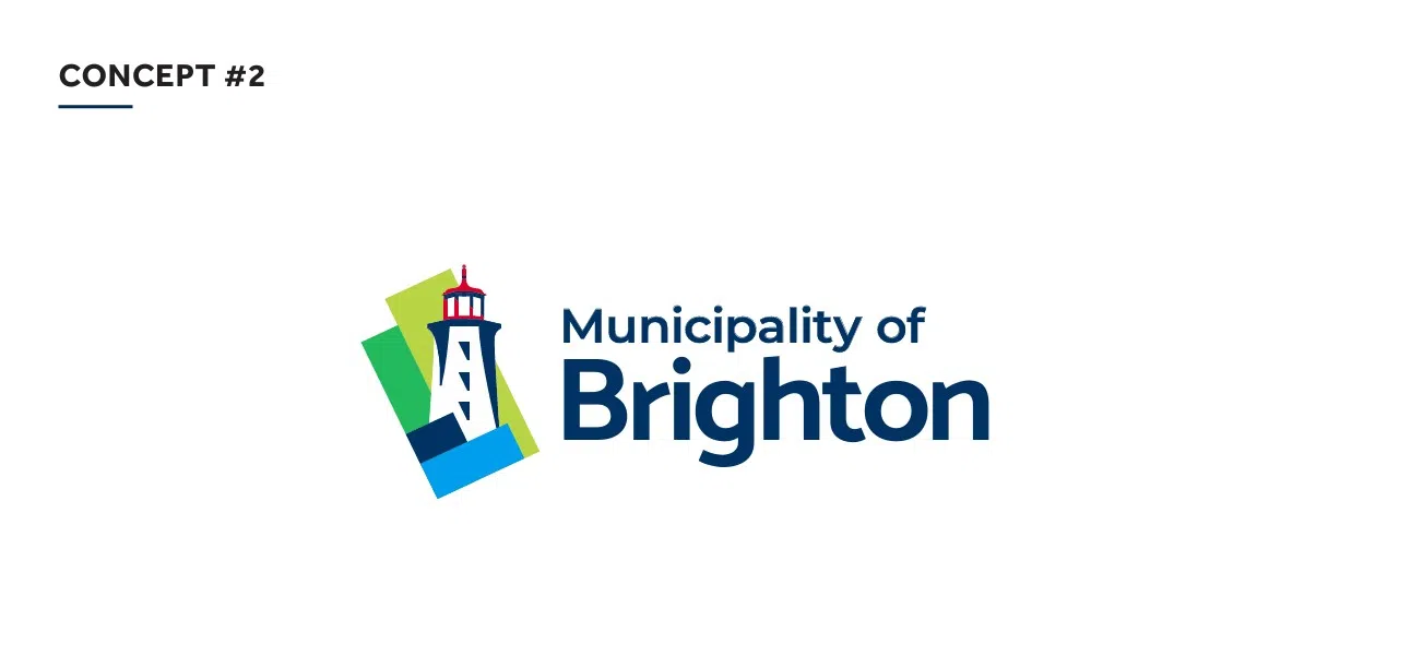
The Municipality of Brighton is getting a new logo.
On Monday, council chose between two options presented by a consultant, voting in favour of option # 2.
Both logos incorporated the municipality’s iconic Presqu’ile Point Lighthouse, but option two also includes a background inspired by the actual geographic shape of the municipality and a colour palette reflecting the local landscape, water and heritage.
The goal of the new logo is to honour Brighton’s local history, landmarks, and natural beauty while introducing a fresh, modern look.
The new brand aims to instill community pride, highlight Brighton’s distinctiveness in a competitive regional landscape, and support economic and community development by attracting investment, new residents, and businesses.


